Components
Make sure to raise building any new components with the team before starting.
If you notice our designs have veered away from the default material implementations and would require work that can’t be achieved easily via the theming engine be sure to raise this with the team.
This project uses the MUI Material UI library as it’s primary sources of components.
Material UI components
Where ever possible components are used directly from MUI and not built from scratch. This is important as we want to be able to easily update MUI as new versions come out. The more we customise and modify these components the harder upgrading will be, and we will also introduce our own bugs.
Add custom props to MUI components
Adding Custom Props
If there’s need to add custom properties to a MUI component, you will need to augment the respective properties module.
This should be done in the theme.tsx file like the following example:
declare module "@mui/material/Chip" {
interface ChipOwnProps {
selected?: boolean
}
}
This will allow you to use the selected prop in the Chip component like the following example:
<Chip selected={true} />And then it will be possible to use the selected prop on our theme object to assess which variant we use depending
on it, for example.
MuiChip: {
variants: [
{
props: {selected: true},
style: {
Style if selected === true
}
},
{
props: {selected: false},
style: {
Style if selected === false
}
}
]
}
Custom components
Custom components should only be written if there is not an already available component in MUI that handles the required use case. Custom components should still be built using MUIs building blocks (Box, Grid etc) so they still take advantage of our core theme file.
Components should presentational in nature and manage displaying data, not fetching and manipulating it. Managing data should be handled in the page component that imports the component. This keeps our components portable and easy to test. Use a Page Component as a data wrapper that passes props to pure React components for layout and structure.
The same applies for translations, define a shape for translations and pass an object containing them into the component.
Aim to write pure components which given the same input always produce the same output
We follow common React practices by using PascalCase for naming both
components and their files. This clear and consistent naming helps make our
code easy to read and maintain.
Composing components to create variants
When creating component variants composition is a powerful pattern for sharing styling and functionality across multiple variants of a component.
Wherever possible we want to avoid duplicating code - the composition pattern allows shared logic to have a single source of truth - this gives us the obvious benefits of making components consistent and easier to maintain.
Using this RecipeCard component as an example we can show the benefits and challenges of composition.
When deciding where to split a component we need to analyse the design and see which elements are shared across variants.
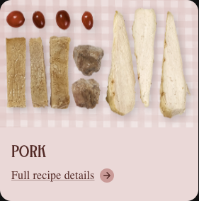
Take these recipe card variants:
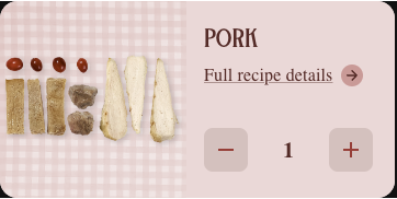
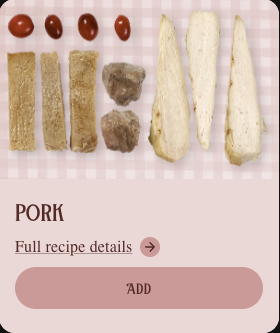
We can see that the title, recipe details and image are consistent across all variants. This means we can build a base component which implements these shared details across the variants. Our base component will look like this:
  // RecipeCard.tsx

  <Card>
    <CardMedia>
      <Image />
    </CardMedia>
    <CardContent>
      <Typography>
        {title}
      </Typography>
      <Link>
        {recipeDetails}
        <ArrowForwardRoundedIcon />
      </Link>
      {children}
    </CardContent>
  </Card>
The children prop is one of 2 features which will allow us to compose our 2 variants.
Using it we can create our variant components and inject in the components specific to that variant.
  // RecipeCardQuantity.tsx

  <RecipeCard>
    <IconButton>
      <Remove />
    </IconButton>
    <Typography>
      {quantity}
    </Typography>
    <IconButton>
      <Add />
    </IconButton>
  </RecipeCard>
Note that in the design for the recipe quantity card our image is aligned to the left of the content instead of above it like in our base and selectable components.
In order to acheive this we can compose our props as well as the components themselves.
MUIs slot pattern is a good way of achieving this.
  // RecipeCard.tsx

  type Props = {
    slots?: {
      Root?: CardProps
      CardMedia?: Omit<CardMediaProps, "width">
    }
  }

  <Card {...slots?.Root}>
    <CardMedia {...slots?.CardMedia} width={100}>
      <Image />
    </CardMedia>
    ...
  </Card>
We can make decisions on what props should be exposed and what should be uneditable - the way the width property is set in the above code is an example of this.
By exposing the card media props above we can perform any overrides we need in our variants:
  // RecipeCardQuantity.tsx

  <RecipeCard
    slots={{
      Root: {
        sx: {
          flexDirection: "row"
          }
        }
      },
      CardMedia: {
        sx: {
          alignItems: "center",
          justifyContent: "center"
        }
      }
    }}
  >
    ...
  </RecipeCard>
Another way to achieve this would be a custom prop such as imageAlign, however this approach can lead to a large build up of specific props on a component over time making it harder and harder to maintain.
This Modal component is a real world example of a component which could benefit from the composition pattern:
// Modal.tsx

type Props = {
  isModalOpen: boolean
  setOpenModal?: (arg: boolean) => void
  children: JSX.Element | Array<JSX.Element>
  width: ModalWidth
  textAlign?: Alignment
  padding?: boolean
  showCloseButton?: boolean
  bottomSticky?: boolean
  position?: 'top'
  fullHeight?: boolean
  fadeAnimation?: boolean
  variant?: Variant
  flex?: boolean
  onCloseButtonClick?: () => void
  loading?: boolean
  bodyScroll?: boolean
  overflowVisible?: boolean
  closeButtonBackground?: AllowedCloseButtonColours
  backgroundColour?: 'brandWhite' | 'brandYellow100'
  closeButtonIcon?: CloseButtonIcon
  closeButtonIconSize?: number
}
It is very hard to understand (and test) how all the possible combinations of props above will interact. By splitting the modal variants into more specific composed components as well as using the slot pattern instead of specific props like ‘padding’ the component could be made far simpler and easier to maintain.
Styling
MUI components should be styled using the powerful theming functionality.
Adding styling here applies styling to a component globally and allows us to easily upgrade MUI in the future.
Styling on the element level should be done inline via MUIs SX prop. The SX props has access to theme-aware properties which simplifies keeping our styling consistent site-wide.
  <Box
    component="polygon"
    points="0,100 50,00, 100,100"
    sx={{
      fill: (theme) => theme.palette.common.white,
      stroke: (theme) => theme.palette.divider,
      strokeWidth: 1,
    }}
  />
Library
Our component library is built to be completely agnostic to the site. Components can rely on our overall stack, however they should contain no specific data layer and copy/or branding directly related to the cats site. A components branding will be applied via the material theme of the site it is included in. All components should be portable so they can be reused by future sites.
Whenever building or modifying a component in the component library always keep in mind that it should be usable in any of our other sites with the same stack.
Components that are specific to the cats site belong in the cats repository.
Palette
When styling the site colors can be accessed via the palette option. How this is accessed is dependant on if you are working on a server or client component.
Client
In client components you can use the useTheme hook to access the theme and the palette object attached to it.
const theme = useTheme()

theme.palette.primary.main
Server
As hooks cannot be used in server components we instead can import the palette object directly.
import palette from "@cats/app/palette"

<Box
  sx={{
    backgroundColor: palette.primary.light
  }}
>
Transitions
MUI provides various Transition components which should cover all common use cases and provide a centralised way to keep transitions consistent.